
.jpg)
MEASURING SATISFACTION INTERNATIONALLY
Why culture rating matters
Most companies that track NPS or CSAT across several countries already know this : a score does not have quite the same meaning from one country to another. For the same actual level of satisfaction, a Japanese, Brazilian, or French customer will not give the same score.
This observation is well known. It is rarely measured. We wanted to quantify it: to what extent does rating culture, independently of the quality of the experience, influence scores?
Comparing NPS across countries often amounts to comparing things that are not measured on the same scale. This is so widely acknowledged that the industry has developed workarounds; for example, in the context of European NPS, a score of 8 is included among promoters, on the grounds that in Europe respondents rarely give 9s or 10s.
One clarification is needed: a Google Maps rating measures satisfaction, whereas NPS measures an intention to recommend. They are not the same questions. But what we are trying to capture is neither one nor the other: it is the way a culture assigns a score on a scale. This habit — avoiding extremes, reserving the highest score, expressing dissatisfaction or not — is a trait of respondents, not of the question being asked, and it affects satisfaction, NPS, and CSAT (Customer Satisfaction Score) in the same way. Google Maps therefore serves as a proxy for a country’s rating culture, not as a substitute for NPS.
These adjustments are based on a sound intuition, but they treat the symptom without measuring its scale. Hence our question, framed in reverse: at comparable service quality, which countries rate most generously, and which countries rate most severely?
The challenge was to isolate the way local customers rate, while neutralizing two confounding factors: the actual quality of the service, and the presence of tourists.
The source. Google Maps. A considerable volume of reviews, free, available in almost every country, and supplied overwhelmingly by local residents.
The locations. Rather than famous or tourist-heavy sites, we selected three deliberately ordinary categories: gas stations, hair salons, and laundromats. Three choices that serve the same methodological purpose:
They exist all over the world, making comparison possible.
They meet everyday needs, and therefore generate a large number of reviews.
They are used only marginally by tourists, which limits their influence.
And above all, they offer a standardized and comparable service from one country to another. This is the point that neutralizes the most dangerous bias: if we compare the same type of ordinary, homogeneous service everywhere, then the rating differences observed no longer reflect service quality, but rather local rating culture.
The filters. Each establishment had to have at least 25 reviews, written very predominantly in the local language; an additional safeguard to ensure that the ratings came from local customers rather than visitors passing through.
The scope. 20 gas stations, 20 hair salons, and 20 laundromats per country, meaning nearly 3,000 establishments analyzed across 50 countries. For each country, we calculated an average score out of 5, comparable internationally. The data collection was carried out with the support of AI (Gemini, Claude) to process this volume while respecting the filters above.
Finally, as a consistency check, we compared this ranking with our own multi-country B2B NPS data. The trends observed on Google Maps move in the same direction as what we measure among our clients; a signal that the differences captured do indeed reflect rating habits, and not only the behavior of the general public.
To make these differences easy to read at a glance, we ranked the 50 countries by average score, then grouped them into five quintiles — from the most generous (Q1) to the most severe (Q5). The map below provides the geographic reading: not where customers are most satisfied, but where they rate highest or lowest, at comparable experience.
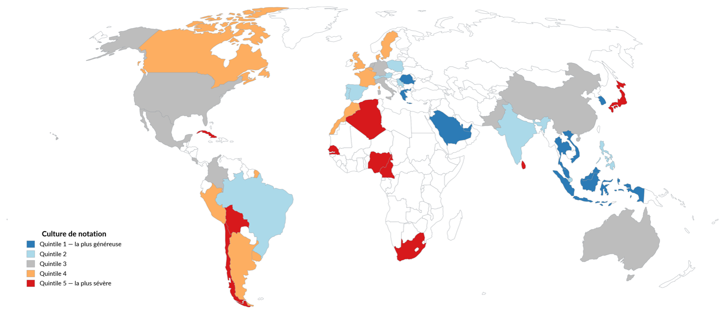
Differences between countries are largely explained by culture, and cluster by region in ways that are consistent with the literature on response styles.
Southeast Asia is among the most generous: Thailand (1st), Vietnam (3rd), Malaysia (5th). In these cultures, publicly expressing dissatisfaction may be perceived as discourteous, which pushes scores upward. The Middle East follows a similar logic: Qatar (3rd), Saudi Arabia (7th).
Japan, by contrast, is one of the most severe countries. This does not mean that service quality is worse there; quite the opposite. A 5/5 is reserved for the exceptional; a service that is simply good is considered normal, and therefore rated as such. High standards mechanically produce lower scores.
The United States occupies an intermediate position (28th), which is surprising for a country often seen as enthusiastic. Research on response styles describes a stronger use of extremes there — very good as well as very bad ratings — whereas other cultures tend to smooth scores more. Our measure captures only the average, but it places the United States lower than its reputation might suggest.
Europe is not a single block. Central and Eastern Europe, along with part of Southern Europe, rate rather generously — Romania and Greece (7th), Switzerland (11th), Austria and Poland (12th), Spain and Serbia (17th), Portugal (20th) — while Western and Northern Europe are more restrained: the Netherlands and Denmark (30th), Belgium (36th), the United Kingdom (38th), and especially France (40th). This Western restraint is consistent with a culture in which criticism is valued more than praise — the Middle Response Style described by research: people avoid extremes, compress scores toward the center, and the average suffers as a result.
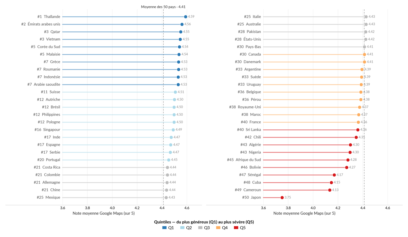
Ranking of the 50 countries. Average score by country, grouped into five quintiles from the most generous (Q1) to the most severe (Q5). The quintiles group countries into blocks of ten within the ranking; two countries with the same rounded score may therefore fall on either side of a boundary (e.g. France and Sri Lanka, at 4.36).
The consequence is straightforward: the same score cannot be compared from one country to another. A 3/5 in Japan may reflect a perfectly acceptable experience; a 5/5 in Thailand may simply reflect a more positive way of using the scale. Interpreting a score — whether Google Maps, NPS, or CSAT — requires taking into account the rating culture of the country in which it was given.
Like any analysis of this kind, this one comes with limitations that we fully acknowledge:
Residual tourism. The local-language filter greatly reduces the influence of tourists, without being able to eliminate it completely.
Uneven category availability. Some countries have few laundromats; in Northern Europe, many gas stations are automated, with fewer service interactions to rate.
Review self-selection. On Google Maps, those who leave a review are the most motivated — often the very satisfied or the very dissatisfied. This propensity to leave a rating, and to polarize, also varies by country. It is nevertheless an integral part of the rating culture we are trying to measure, and it also affects traditional surveys: a relational or transactional questionnaire is also completed only by a self-selected fraction of customers, and this bias, once again, is subject to the same cultural variations from one country to another.
What should be done with these differences? Above all, do not twist NPS in order to “correct” it: counting 8s as promoters, as in European NPS, shifts the bias without measuring it. The data remains useful on two conditions. First, compare what is comparable: a country with itself, over time. Since rating culture is relatively stable, it cancels out in a year-over-year evolution — +3 points in Japan or Brazil mean the same thing, because the cultural bias is constant from one year to the next. Second, when comparing countries with one another, do so within the same cultural zone, or keep in mind the approximate scale of the bias highlighted by this study.